Backstage Improv

One of the most useful principles of scrap wrap is the “messy backstage.” There are six sides to a typical gift box: 1 back, 1 front, 2 end-folds, 2 plain sides. A wrapped present will normally rest on its back. That side is hidden from view. By permitting this area to be messy, we give the process of wrap improv greater freedom and speed. Scrap wraps are easier when you can hide anomalies of fit and finish on the back.

In this particular wrap, however, something funny happened. The messy backstage began to look more engaging the simpler front side. Four fragments of paper and an elastic ribbon join in a lively constructivist collage.

Ankylosaurus Wrap

A very simple wrap for a very young recipient. Two foil paper fragments. Both use single-symbol graphic detail. But they contrast in brightness. One has a white background. The other is darker with blue. The mid-package join of the two papers is a simple folded edge. Foil papers are especially good at this. The finishing touch, its “bow,” is a small ankylosaurus toy, hot-glued onto the wrap.

Asymmetrical Pinecone

This wrap demonstrates the practicality of two-piece wrapping. I had two pieces of the blue paper. Neither piece was large enough to cover the present’s box. I wrapped the two pieces on either end of the gift’s box, with traditional folds on the ends. That left a raggedy unwrapped section in between the two blue sections. Following the protocol of two-piece wrapping, I covered that messy area with a wide band of thick silver paper. Its metallic texture contrasted nicely with the non-glossy texture of the blue paper. I positioned this band so that its lower edge aligned with the vertical middle of the gift box, creating a blue square on the bottom and a half-silver half-blue square on top..

I had planned that this wrap would feature a pine cone. I had just picked up four freshly fallen cones during a recent and very windy hike in the foothills. Before I glued the cone in place I studied the possibilities of placement for the magenta ribbon. I avoided centering it. Instead, I picked a location for the pine cone to right and then placed the ribbon centered between the cone and the left side of the package. 

The last step was to make and place a tiny name tag for the recipients. They are custom shaped and made be an integral part of the design.

Tribox #1

tribox

I have so many small boxes that I felt it would be a good idea to design wraps that used this surplus. The gift is in the largest box. It is wrapped with a page from a museum newsletter. The two added boxes are attached to the primary box. The littlest box, with a red foil surface and black angled stripes, serves two purposes. It is the name tag for the recipient. And it is a handle attached to the top white middle box. That white box has no wrap, and the offset of its lid is obvious. When you grab the black striped “handle” the white lid lifts off, revealing a curled white strip inside telling the recipient that the gift is inside the bg box. Silly, yes. But hopefully of some charm.

Old Leaf

wrap art with autumn leaves

I love the dried leaves that carpet the autumn pathways. I began preparing for this wrap a while ago. And I added new leaves right up to the day I made this wrap. I have used large green leaves in the past. They can be shaped to the package. But what would allow me to use brittle dried leaves. I decided that I would try foam stilts to lift them free of the underlying wrapped box. I cut short pieces of white foam and hot-glued them onto individual leaves. When they cooled and were stable I trimmed the bottoms to make them stable and free-standing with three legs. Then I glued them onto the white-wrapped gift box. I added some that had only two legs, raising them higher that the initial batch of leaves so that the collage had a feeling of being airborne. Eventually there were enough to call it a finished composition.

Two-piece with Twig Label

wrap art two piece with twig

I put the gift into a box and wrapped it some old bright white stationery. I then review my wrap-scraps drawer and found a magazine page with this lively grid of textures. I wrapped it around the now white box leaving the top quarter of the space open. I decided that dimension was called for, a helping of haptics for a happy birthday. I reached into the twig bin and came up with this shiny bit of aspen. I inscribed the greeting and glued it on. The two piece is a quick wrap strategy.

Two Piece with Alphabeads

The two pieces of paper I used came from a large-format magazine with elegant advertisements. The smaller piece with the dot gradation ends in blank white, with an intriguing curve of remnant typography. I labeled the gift with alphabets, whose dimensionality gives the wrap a sculptural tease.

Stripes

This is a classic two-piece wrap. I used a remaining piece of blue Pantone paper on the bottom. Then I reached for a packet of printed American flags that somehow made it into my paper drawer. I chose to use only the stripes, which still left the wrap with a strong hint of flag. I covered the join with a bit of skinny black ribbon. A mini label completes the task.

Band Wrap Combines with Two-piece Wrap

jandr


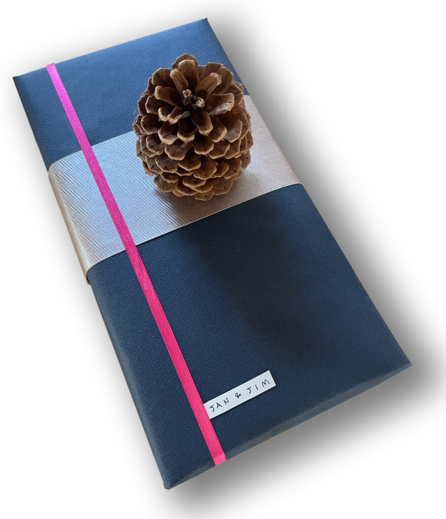
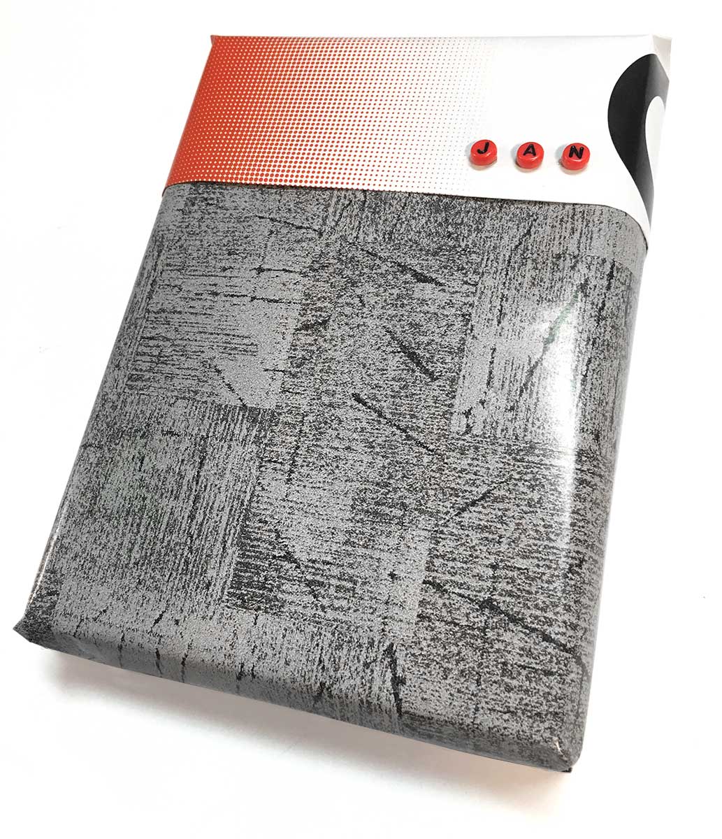
This is the second of Jacob and Rachel’s wraps. I began this wrap as a two-piece wrap. The gold-polka-dot paper had just arrived on a wrapped calendar. But it was to be the second layer of the two-piece technique. I chose the black shiny paper of shopping back as the foundation.

The bag had a white logotype printed on its sides. The vertical lines of its extremely condensed type suggested using the vertical lines of the band wrapping to cover up the logotype; if some of the white lines showed through they would become part of the band design.

First I made a temporary placement of the gold paper so I would know the angle of the edge where two pieces join. Then I wrapped the thick black paper onto the top half of the gift.

The bands went on next, thins strips with soft, puffy folds along their edges.  I left plenty of black paper to the left and right of the bands, which were now looking like a kind of “bow” in the evolving composition. I placed and fixed the gold polka-dot paper. At this point the bands became more of a flower arrangement sitting in the vase of gold paper.

The basic wrap was in place but the wrap was still not complete. I experimented with various kinds of ribbon, placing them in sympathy with the angles of the wrap, but crossing on top of all the wrapping components. As I analyzed the way the dimensional bands tucked into and under the round folded edge of the gold paper, it seemed a good idea to make the ribbon both cross over the two-piece border and also tuck under the bands, ironically enhancing the illusionistic space of this flat design by real dimensional means.

I was getting close to completion. I had wanted some gauze ribbon in the system. I took a red piece and glued it so that it tucked into the  two-piece border, and then ran down parallel to the black-and-white ribbon. I took one of my computer printed labels, cut it into a strip and placed in tuck-under style adjacent to the red gauze ribbon. Now the wrap was finished, a lively constructivist design with a very dimensional feel and plenty of reference to traditional wrapping’s luxury textures.